Nobody reads your profile the way you wrote it.
You wrote it top to bottom, as a record of where you have worked. They read it in about ten seconds, in one glance, while deciding whether replying to you is worth their time. They are not evaluating your career. They are answering one question: is this person going to be useful to me.
I score client profiles against ten parameters, each out of 10, in the order a reader meets them going down the page. This is the whole checklist, including what separates a 3 from an 8 at every one of them. It is the same rubric behind LinkedIn Growth Code, and the same one I use in the Unlock LinkedIn programme.
Read it with your own profile open on a phone. That is where most people will see it.
What is the difference between a LinkedIn profile and a CV?
Quick Answer: A CV asks to be considered. A sales page asks to be acted on. A CV is organised around your history and its reader is looking for reasons to reject you. A sales page is organised around one buyer's problem, and its reader is looking for a reason to reply. Every parameter below is somewhere people write the CV version by reflex.
The practical test is a single sentence. A CV says what you have done. A sales page says what happens to them if they hire you. "Founder at Something Ltd" is the first. "I help manufacturers cut quoting time from three days to twenty minutes" is the second.
That sounds obvious written down. It is not obvious in practice, because LinkedIn's own field labels ask CV questions. It asks for a job title, an employer, a date range. Answer those literally and you get a CV. The profiles that convert answer a different question inside the same boxes.
Your first action: read your headline out loud and ask whether it describes you or describes what a client gets. If it describes you, it is a CV.
Here are the ten, numbered, on a live profile. Mine, so you can see what each one looks like when it is actually filled in rather than described.
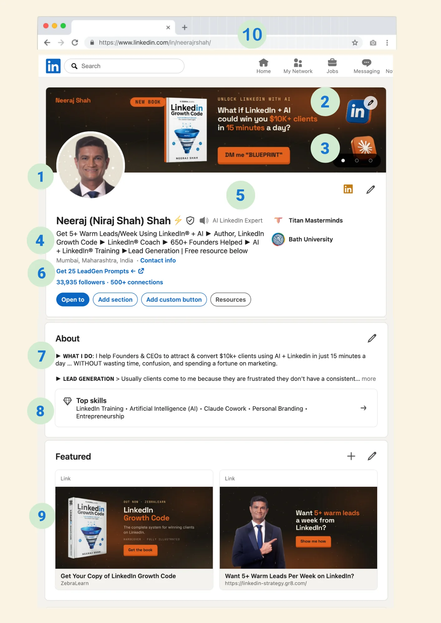
1. What does your profile photo actually need to do?
Quick Answer: It has one job: to look like the person who solves this problem. Four things clear that bar. Taken in the last two years, face filling roughly 80 percent of the frame, a clean background, and an expression that reads as someone you would do business with. Studio quality helps but is not what separates a 3 from an 8.
The common failures are not vanity failures. They are distance failures. A photo where your face occupies a fifth of the frame reads as someone hiding, whatever the camera cost. Cropped from a group shot, it reads as someone who could not be bothered. Five years out of date, it reads as someone whose LinkedIn is not really in use, which is a worse signal than an average photograph.
A profile photo is not asking whether you are photogenic. It is asking whether you look like the person who solves this problem.
This is a client of mine, Asslam, and it is the example I point people to.

Nothing about it is expensive. Plain grey backdrop with nothing competing for attention, even light with no shadow across the face, and an expression that reads as someone who would be easy to talk to rather than someone performing seriousness at a camera. The blazer and the lapel pins do unpaid work: they make him specific, and specific is what gets remembered.
The 80 percent is measured inside the circular crop, which is all LinkedIn ever shows. The coloured ring around it is a brand device, not part of the frame you are filling.
How I score it: 0 to 2, missing or unprofessional. 3 to 5, professional-ish but dated, badly cropped or low resolution. 6 to 8, professional, well cropped, recent. 9 to 10, studio quality, brand aligned, conversion grade.
Your first action: open your profile on a phone and look at the photo at thumbnail size, because that is how it appears in a feed. If your face is not immediately readable at that size, it is too far away.
2. What should go on your LinkedIn banner?
Quick Answer: A pitch and proof, at 1584 by 396 pixels. The pitch is ten words or fewer, ideally phrased as a question. The proof is two or three recognisable logos, a defensible number, a book cover, or a line from a client. The instruction that goes with them is scored separately, as parameter 3, because it is the part almost everyone leaves out.
This is the largest piece of free advertising real estate you own, at the top of the page, seen by everyone who lands there. Blank, a default gradient, or a company logo floating in space are all the same outcome: a wasted first impression.
The question format outperforms the statement format, because a question is harder to skim past. "What if your corporate gifts actually built your brand?" does more work than "Premium Corporate Gifting Solutions", and it does it in the same space.
Keep it to a maximum of three brand colours and one clear type hierarchy. Text that is unreadable on a phone is the same as no text at all.
One specification most people miss: the full 1584 by 396 image shows on desktop, but mobile crops the top and bottom. Keep anything that matters inside a safe zone of roughly 1350 by 220 pixels, centred. A pitch that gets cropped on the device most people are holding is a pitch nobody reads.
The best example I know of this parameter belongs to someone with nothing left to prove.
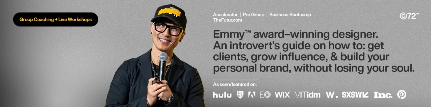
Read what it is actually doing. The pitch is not a slogan, it is a promise with an audience inside it: an introvert's guide to getting clients and building a personal brand, without losing your soul. It names who it is for and what it protects them from, which is a harder and better thing than describing a service.
Then the proof arrives in two layers. An Emmy in the first line, and underneath it a row of logos, hulu, Adobe, Wix, MIT, SXSW, Inc. and Pinterest, under the words "As seen/featured on". Nobody reading that needs to be told he is credible.
What it does not carry is an instruction, and that is worth noticing rather than glossing over. There is a URL and there are product names, but nothing tells you to do one specific thing next. At his level of recognition that is a defensible choice, because people already know how to find him. If nobody has heard of you yet, it is the most expensive omission on the banner, which is why the next step is scored on its own below.
How I score it: 0 to 2, missing or the LinkedIn default. 3 to 5, an image but no pitch and no proof. 6 to 8, a clear pitch or clear proof, on brand. 9 to 10, both, readable on a phone.
Your first action: write the ten-word question first, before you think about design. If you cannot write it, the design will not save it.
3. Does your banner tell the reader what to do next?
Quick Answer: It needs one instruction, and one only. A button-shaped block saying "DM me BLUEPRINT" or "Get the free checklist" turns a poster into a door. A banner with a pitch and proof but no next step scores 6 at best, because the reader who was persuaded has nowhere to go.
This is scored on its own because it is the single most commonly missing element on the whole profile. People spend a weekend on the design and then leave the reader admiring it.
Make it an instruction rather than a description. "Corporate Gifting Solutions" is a label. "DM me KIT for three ideas free" is something a person can do in four seconds, on the device they are already holding.
A DM keyword beats a URL here for two reasons. A banner is an image, so a URL in it is not clickable, and typing it out is friction most readers will not accept. A keyword starts a conversation in the app they are already in, and a conversation is the thing you actually want.
Keep it to one. Two instructions is the same as none, because a reader asked to choose usually chooses to leave.
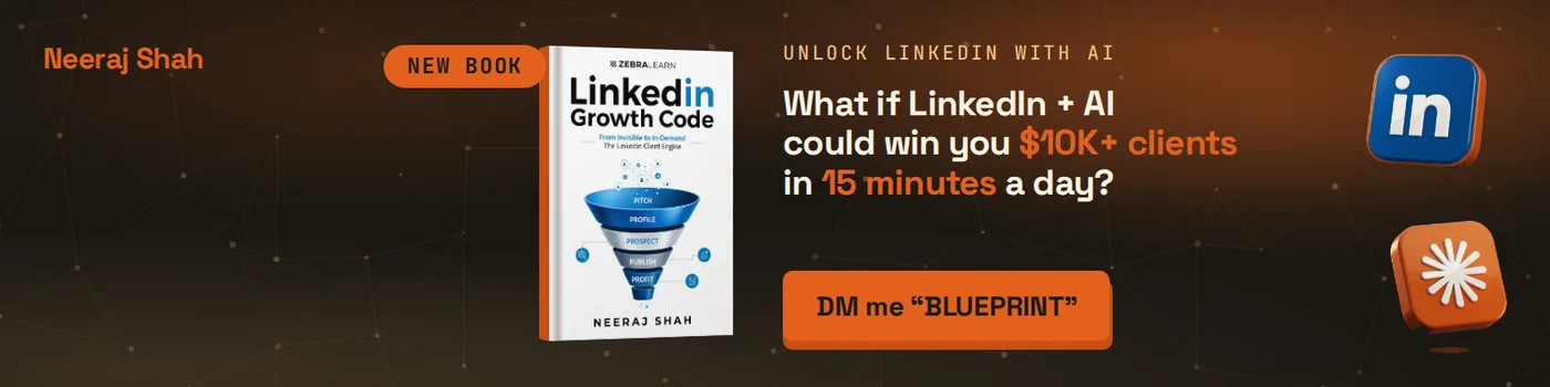
Mine puts the instruction in a button shape and makes it a keyword rather than a link, for the reason above: it is one tap inside the app the reader is already in. The pitch above it is a question, the book beside it is the proof, and the orange block is the only element on the banner asking for anything at all.
How I score it: 0 to 2, no instruction at all. 3 to 5, a website URL sitting in the image with nothing telling the reader why. 6 to 8, a clear instruction. 9 to 10, a clear instruction, visually distinct, and low friction such as a DM keyword.
Your first action: add one line to your banner today, styled as a button. It is the cheapest four points on this scorecard.
4. How do you write a LinkedIn headline that gets replies?
Quick Answer: Use the formula: I help [who] achieve [specific result] using [method], then a proof number, then a soft call to action, separated by pipes. You have 220 characters. A headline earns a 9 only when it carries all five: who, result, method, proof, and an instruction. A job title alone scores 2.
This is the most-read text on your profile and the place where people write the least useful thing available to them.
"Founder at Something Ltd" tells a buyer what you are called. It does not tell them what happens if they hire you. "Marketing Consultant | Helping businesses grow" is worse in a specific way: it looks like it is doing the job while saying nothing a competitor could not also say.
Check yours for three things:
- A measurable outcome, not an adjective. "20 hours a week" rather than "transformative".
- Proof, meaning a number you could be challenged on in public. Years, clients served, revenue, a named platform.
- An instruction, something concrete they can act on now, such as "DM me AUDIT for a free profile review".
Pipes help, because nobody reads a headline as a sentence. They scan it in fragments, and pipes tell them where the fragments end.
How I score it: 0 to 2, job title only or empty. 3 to 5, mentions who and what but carries no proof and no call to action. 6 to 8, a clear formula with proof or a call to action. 9 to 10, the full formula.
Your first action: rewrite yours once, then cut it to 220 characters. The cutting is where it gets good.
5. What is the custom pronoun field, and why does it matter?
Quick Answer: It is the small field next to your name, intended for pronouns, and it follows you everywhere: into DMs, into comment threads, into every connection request you send. Two to four keywords of expertise there gets repeated hundreds of times a week in places your headline never reaches. Most people leave it empty.
"Corporate Gifting Expert." "AI LinkedIn Expert." That is the whole exercise. It is not a headline, it is a label, and it wants to be memorable rather than complete.
The keywords matter twice over. A human reads them as positioning. LinkedIn's search reads them as terms you are associated with, and so increasingly do the AI assistants people now use to shortlist experts before they ever open LinkedIn.
Using the field for pronouns is entirely fine and it is a real signal to some readers. It is simply worth knowing that this is the trade you are making, because the field cannot do both jobs at once.
How I score it: 0, empty. 3 to 5, pronouns only or something vague. 6 to 8, a clear niche keyword. 9 to 10, sharp, specific and memorable.
Your first action: pick the two words a client would use to describe what you do when recommending you to someone else. Not the words you would use.
If you would rather watch than read, The LinkedIn Profile Formula That Gets Clients Booking You covers the same ground with a profile open in front of me. The remaining five parameters are below.
6. Where should the link under your name send people?
Quick Answer: To one specific offer with its own page, not to your homepage. A homepage asks the visitor to decide what to do next, which is work, and work at that moment loses most of them. A lead magnet with custom link text, "Get 25 LeadGen Prompts" rather than "Visit my website", is the difference between a 4 and a 9.
The mechanics matter less than the principle: one link, one offer, one capture. A guide, a checklist, a calculator, a short video, a prompt pack. Something a stranger would exchange an email address for without feeling they had been charged for it.
The commonest miss is having the link and wasting the label. LinkedIn lets you write the call to action text. Leaving it as a bare URL throws away the only chance you get to say why anyone should click.
How I score it: 0 to 2, no link. 3 to 5, a generic website link. 6 to 8, a dedicated landing page with weak call to action text. 9 to 10, a sharp lead magnet with strong call to action text.
Your first action: if you do not have a lead magnet, link to your booking page with explicit text rather than to your homepage. It is worth three points and takes two minutes.
7. How do you write an About section in PAS format?
Quick Answer: Open with a hook aimed at one person, then run Problem, Agitate, Solution. Write it in the first person, keep the paragraphs short enough to scan, carry authority signals with real numbers, and end with one specific call to action. The failure mode is brochure copy: "We are a team of young enthusiastic professionals" is a 2.
The hook has to land inside a line and a half, because that is what shows before LinkedIn truncates it behind "see more". Aim it at the exact person you want, not at everyone:
Your employees unbox a joining kit. Within five seconds, they decide whether your company gets it, or does not.
Then PAS does the work. Problem, named in their words. Agitate, meaning what it costs them to leave it alone, which is the part most people skip because it feels impolite. Solution, which is you, described as a mechanism rather than as a mood.
Through it, carry what I call the ACE signals: authority, credibility and expertise. Twelve years. Five hundred companies. A named client. These are not boasts, they are the reason a stranger should believe the paragraph above.
Then one instruction. Not three. "DM me KIT and I will send three ideas free" converts because it is small, specific and free.
Write it as a person. The About section is the one place on the profile where a reader is deciding whether they like you, and nobody has ever warmed to a paragraph that begins "We are a team of".
How I score it: 0 to 2, empty, generic, or brochure copy. 3 to 5, some personal voice but no structure and no call to action. 6 to 8, clear structure, some proof, a soft call to action. 9 to 10, hook plus Problem Agitate Solution plus authority signals plus a call to action.
Your first action: cut the first paragraph and see whether the second one works as an opening. It usually does, and it is usually sharper.
8. Which five skills should you pin at the top?
Quick Answer: Five, all niche-specific, no near-duplicates. LinkedIn shows your top skills in their own block near the About section, so these are read by buyers rather than only by recruiters. Three sharp skills beat twenty generic ones, and a duplicate wastes a slot you cannot get back.
"Branding" plus "Consumer Branding" plus "Corporate Branding" is one skill written three times. "Corporate Gifting" and "Employee Onboarding Kits" are two skills that tell a reader what you actually do.
Pick them the way you would pick search terms, because that is partly what they are. The test is whether a stranger reading the five could describe your business back to you. If the five could belong to any consultant in your industry, they are doing nothing.
Order matters more than people expect. The block truncates, so the first two carry most of the weight.
How I score it: 0 to 2, no skills or defaults left in place. 3 to 5, five generic skills, or duplicates eating slots. 6 to 8, niche skills but weakly ordered. 9 to 10, five sharp niche skills, no duplicates, strongest first.
Your first action: open your skills and delete every one that a competitor could also claim. Replace them with what you are actually hired to do.
9. What belongs in the Featured section?
Quick Answer: Two tiles, no more. A 60 to 90 second video sales letter, and your lead magnet. The video is the highest-converting asset on a profile and almost nobody has one, which is exactly why it is worth the afternoon it costs.
The script is not complicated: who you are, who you help, what result, what to do next.
Hi, I am Neeraj. I help business owners install AI systems that run their marketing and sales. If your business still depends on you for everything, DM me SYSTEM and I will send you the four-way test.
Filmed on a phone, well lit, ninety seconds. It does not need production value. It needs to exist, because it is the only place on a profile where a buyer hears your voice before booking a call, and hearing you is most of what a first call is for.
Five tiles is worse than two. A single post from three years ago is worse than blank, because it tells the reader the profile is dormant.
How I score it: 0 to 2, blank or irrelevant. 3 to 5, something there but not built to convert. 6 to 8, a video sales letter or a lead magnet, done well. 9 to 10, both.
Your first action: film the ninety seconds this week on your phone. The version you post is almost never the one you agonise over.
10. Is your LinkedIn URL optimised?
Quick Answer: It should read linkedin.com/in/firstname-lastname, not a string of digits. It takes a minute to claim, it is free, and it then appears on every business card, email signature, proposal and citation you will ever send. A default URL with digits scores 2 and there is no good reason for it.
The reason it is worth a scorecard slot of its own is that it is the only element here that leaves LinkedIn. Everything else works on the platform. This one works in your email footer, in a speaker bio, in a directory listing, and in the places an AI assistant looks when it is deciding whether two mentions of your name are the same person.
Keep it short and human. If your exact name has gone, add the thing you do rather than a number: neeraj-shah-linkedin reads better than neeraj-shah-8472.
Change it once and then leave it. LinkedIn redirects the old URL for a while, but anything printed with the old one eventually breaks.
How I score it: 0 to 2, the default URL with digits. 3 to 5, custom but cluttered with numbers or filler. 6 to 8, clean and readable. 9 to 10, clean, readable, and used consistently everywhere else you appear.
Your first action: claim your custom URL now, before someone with your name does.
How do you score your own profile?
Quick Answer: Score each of the ten out of 10 using the anchors above, then take the mean to one decimal place. Most profiles I audit land between 3.5 and 5.5. Anything below 6 is losing conversations it never sees, because the people who bounced never appear in any metric you look at.
| # | Parameter | Score /10 |
|---|---|---|
| 1 | Profile photo | |
| 2 | Banner: pitch and proof | |
| 3 | Banner: the next step | |
| 4 | Headline | |
| 5 | Custom pronoun field | |
| 6 | Lead magnet link | |
| 7 | About section, in PAS | |
| 8 | Top five skills | |
| 9 | Featured section | |
| 10 | Optimised LinkedIn URL | |
| Overall |
Then do not try to fix all ten. Pick the three that would move the number most, which for most people are the headline, the About section and the Featured video, and do those properly.
The cheapest points on the card are 3 and 10. A next step on your banner and a clean URL are twenty minutes of work between them, and almost nobody has both.
There is one thing the scorecard does not capture, and it decides whether any of this converts: what you post. A perfect profile attached to an account that publishes nothing, or publishes only advertisements, converts at close to zero. The profile is where a buyer checks you after your content has made them curious. It cannot create the curiosity by itself.
Your first action: score yourself honestly in the table above, then fix only the lowest three.
What is not on the scorecard, and still worth doing?
Quick Answer: Three things sit below the fold and do not get their own slot, because the ten above decide whether a reader ever scrolls that far. Your Experience section, your recommendations, and the platform settings behind the scenes. None of them will rescue a profile scoring 4. All of them raise a profile already scoring 8.
Experience, written as a portfolio rather than a job history. Most profiles have a blank description under the current role, which is the single largest patch of wasted space on the page. The reader who scrolled that far was interested, and a job title with a date range is a strange way to answer interest. Write the founding story in two lines, who you serve, then outcomes with figures attached. "Delivered 10,000 custom orders." "Grew revenue three times in two years." Attach media where you have it. "Responsible for" is job-spec language and caps that section at a 5 whatever else is in it.
Recommendations, five or more, recent, each naming a project and a result. Zero recommendations is a visible credibility gap for anyone more than two years into a business. Asking feels awkward and is less awkward than it seems if you ask for something specific: name the project, and ask them to mention the outcome. "Great to work with" is worth very little. "Cut our onboarding kit turnaround from six weeks to nine days" is worth a case study.
The settings nobody sees. Verification, which is free and increasingly expected rather than notable. Creator Mode, which turns on the "talks about" hashtags that tell the platform what you are known for. And genuine completeness: certifications, languages, awards. Each empty field is a small signal that the profile is not really in use.
Your first action: write three sentences under your current role today, and ask three past clients for a recommendation this week, telling each of them which project to mention.
FAQ
How do I make my LinkedIn profile a sales page instead of a CV?
Change what each field answers. A CV answers "what have you done", a sales page answers "what do I get". In practice that means a headline built on the formula "I help [who] achieve [result] using [method]" rather than a job title, an About section running Problem, Agitate, Solution rather than a career summary, and an Experience section listing outcomes with numbers rather than responsibilities. The fields are the same. The question you answer inside them changes.
What should a LinkedIn headline say?
Who you help, what result you create, how, a number as proof, and one instruction. Separate them with pipes so they can be scanned in fragments, and keep it inside 220 characters. A headline with a measurable outcome, a defensible number and a call to action scores 9 or 10 on my rubric. A job title alone scores 2.
What size should a LinkedIn banner be, and what goes on it?
1584 by 396 pixels. Three elements: a pitch of ten words or fewer, ideally phrased as a question, two or three pieces of proof such as client logos or a number, and one instruction telling the reader what to do next. Maximum three brand colours. Text that cannot be read on a phone counts as no text.
How many LinkedIn recommendations should I have?
Five or more, recent, each naming a specific project and a measurable result. Zero recommendations is a visible credibility gap for anyone more than two years into a business. Ask for a named project and an outcome rather than a general endorsement, because "great to work with" carries far less weight than a sentence containing a number.
Does a video on my LinkedIn profile actually help?
Yes, and it is the most under-used asset on the platform. A 60 to 90 second video sales letter in the Featured section is the only place a buyer hears your voice before booking a call, which is most of what a first call is for. It does not need production value. Filmed on a phone, well lit, ninety seconds, covering who you help, what result, and what to do next.
How long does it take to fix a LinkedIn profile?
The four fields above the fold, meaning photo, banner, tagline and headline, take an afternoon and produce most of the gain. The full ten parameters take a week of evenings if you already have the raw material, longer if you need to film a video or build a lead magnet. Fix the lowest three scores first rather than working through all ten in order.
Four ways I can help when you are ready
- Score your own profile against the table above. It is free and it takes fifteen minutes.
- Take the four prompts. Four prompts for your LinkedIn profile, including the Gemini gem that generates a professional headshot. Free, and they do the parts of this checklist that are slowest by hand.
- Read the book. LinkedIn Growth Code puts this chapter in its place: the profile is chapter three, and it only works once the offer in chapters one and two is fixed.
- Have it built with you. Unlock LinkedIn with AI is 12 weeks, one to one, and installs the positioning, the content engine and the outreach as Claude skills you keep for life. Or book a call and I will tell you straight whether it is the right next move.